Understanding Theme UI: 2 - Styled component
In my last post I attempted to explain Theme UI’s Jsx Pragma, if you missed that, here’s the link again
In this post i’ll be breaking down how to use Theme UI’s Styled component
The Styled component introduces a new concept, it’s related to the previous post by way of CSS properties being mapped
to themes object keys but this time we’ll be mapping HTML elements to the styles object.
This is particularly helpful to understand if you’re looking to style HTML elements for use in Jsx and markdown or MDX
The key to understanding the Styled component is to understand how Theme UI maps HTML elements to the styles object.
Feel free to bookmark the styles spec as i’ll be referring to it frequently
To help demonstrate how the styles work we’re going to build a very simple component which you can see below, i’ve
called it <MrStyled />
styles
The core principle here is understanding the relationship between HTML dom elements and where their respective CSS properties are defined in the theme object
As a practical example go ahead and create a <MrStyled /> component and ensure you can render it to a page as we’ll
need to see and inspect the output. it’s worth noting the styles you see here in this post are mapped to the styles I
already use around my blog which is based on my theme:
gatsby-theme-terminal
// MrStyled.js

import React from 'react';
import { Styled } from 'theme-ui';

export const MrStyled = () => {
  return <Styled.h3>MrStyled</Styled.h3>;
};
If you inspect the output below in your browser you should be able to see that the rendered output of <MrStyled /> is
an HTML <h3> element and will most likely have a weird class name, e.g “.css-1cl1f0n”. Class names are automatically
generated by Theme UI but you can if you need an escape hatch add your own, although I advise you don’t
If you inspect the output you should see it has CSS similar to the below
I’d like to draw you attention if I may to the absence of the className attribute in MrStyled.js which begs the
question, where the W.T.Flip are the styles coming from?
The secret lies in the theme object an example of which can be seen below. You’ll see there’s an object called styles
and within styles there’s an object called h3 and within the h3 object are the styles that Theme UI applies to
<Styled.h3 />
// path-to-theme/index.js

export default {
  colors: {
    secondary: '#c39eff',
  },
  fonts: {
    heading: 'Inconsolata, monospace',
  },
  fontWeights: {
    heading: 700,
  },
  styles: {
    h3: {
      fontFamily: 'heading',
      fontWeight: 'heading',
      fontSize: '18px',
      marginTop: 0,
      marginBottom: 16,
      color: 'secondary',
    },
  },
};
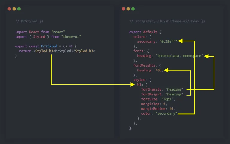
There’s a few other things going on in theme.styles.h3 which i’ll attempt to explain now. You may or may not know but
in Object Oriented JavaScript it’s not possible for an object key to reference itself of a parent object.
Using the above as an example the fontFamily value is “heading”, heading is a “string” which in normal OOP wouldn’t
mean anything but Theme UI is able to map “strings” to values contained elsewhere in the theme object.
In the case of fontFamily Theme UI maps the “heading” string to theme.styles.fonts.heading which has a value of
“Inconsolata, monospace”. Theme UI uses the same approach for fontWeight which maps to theme.fontsWeights.heading,
similarly color is mapped to theme.colors.secondary.
Understanding where in the theme object Theme UI looks to find styles for HTML elements is a fundamental requirement if you’re planning on using Theme UI to style your project.
It’s also worth drawing attention to the following note from the docs
Not all HTML elements are available with the dot notation syntax. For example button is not rendered by markdown, and not included. See variants for an alternative way to style elements.
Take some time to familiarize yourself with both the Styles and the Theme Scales and in the next post I’ll explain a little more about components and variants